

Colorful tea cups can add a single accent to a quiet tea table or bring several existing pieces together. The most useful starting point is not the brightest photograph. It is the color you already enjoy, the kind of surface you want to look at every day, and the amount of tea you usually pour.
A softly blended glaze and a strongly patterned cup can both be colorful, but they create different visual effects. Compare the whole cup, including its interior, foot and rim, rather than choosing from one cropped image. Then check the product details separately: an attractive finish does not tell you the capacity, care requirements or pieces included.
Choose the role of the cup before choosing the color
Decide whether this purchase will be your everyday cup, an accent beside a plain teapot, or one of several cups used together. For an everyday piece, a color that works with your existing tray and dishes may remain appealing longer than a shade selected for one special table setting. For an accent piece, stronger contrast can be the point.
Take a quick photograph of your usual tea spot before shopping. Note two or three colors already present: perhaps pale wood, a white pot and a dark tray. You do not need to match all of them. Repeat one color or choose a cup that stands apart from them deliberately. This makes a long product grid easier to narrow down.
- One personal cup: prioritize the finish you like close up, along with a practical serving size.
- A cup beside a patterned teapot: try a quieter surface or repeat one small color from the pot.
- Several different cups: keep one shared feature, such as a blue base color or a similar rim line.
- A display shelf: compare the side profile and foot as carefully as the overhead view.
- A gift: check the recipient's cup size and style preferences, then confirm packaging separately.
Solid color, gradient or visible pattern?
Start by separating color from pattern. A blue cup might have an almost uniform surface, a gradual transition into purple, or a dense field of pale flecks. Those are different visual choices even when the main color is the same. Search labels such as decorative or unique are broad; the photographs are more useful for deciding which finish you actually prefer.
Solid-looking surfaces keep the outline prominent
A visually quiet surface makes the cup's outline easier to notice. This can work beside a busy tray, a floral tablecloth or other decorated ceramics. Look at several photographs before treating a glaze as uniform, however. Reflections, subtle texture and changes around the base may be less obvious in a small thumbnail.
Gradients add color without a distinct motif
A gradient is a useful middle ground if you want more than a single shade but do not want a large illustration. Look for where the transition happens. A pale upper area with a dark lower body creates a different balance from an evenly blended surface. A contrasting foot can also connect the cup to another object on the table without making the whole arrangement match.
Speckles and contrasting details make a stronger accent
A surface with many light and dark marks can remain visually active even when the palette is limited. Compare a full-cup photograph with a close view. The close view shows texture and detail; the full view shows whether the pattern still appeals at normal table distance. Do not assume a product name identifies the exact technique or material used to produce those marks.
Two colorful ceramic cups compared
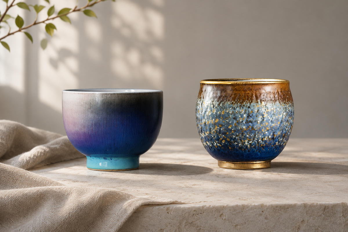
These ARTTEACUP examples show two different approaches within a broadly blue palette. The descriptions below refer to the store's actual product photographs and listed details. They are separate products, not a two-cup set. The header is an illustrative scene; the individual photographs in this section are product images.
On a phone, swipe sideways to read the full comparison.
| Cup | Visible finish | Listed capacity | Listed diameter | Selection point |
|---|---|---|---|---|
| Twilight Gradient Glaze Teacup | Grey upper area, blue-purple body and turquoise-colored foot | 95 ml | 7.3 cm | Smaller serving with a blended color effect |
| Geometric Gold Rim Ceramic Tea Cup | Blue version shown with pale speckles and warm, gold-colored accents | 150 ml | 7.6 cm | Larger listed serving; select the intended color option |
Twilight: blended color and a small serving
The Twilight Gradient Glaze Teacup has a rounded, handleless body. In the product photograph, a grey upper area moves into blue and purple, with a turquoise-colored foot below. The effect comes from the relationship between these areas rather than a large drawn motif.

Its listed 95 ml capacity makes it a smaller serving cup, not a substitute for a large breakfast mug. Consider it if you already pour tea in small rounds and want a colorful piece that does not depend on an illustrated design. A plain light tray would make the darker body stand out; a blue accessory could repeat one of its shades.
Geometric Gold Rim: a more detailed surface
The blue version of the Geometric Gold Rim Ceramic Tea Cup shows a dark blue lower area, pale textured marks and warm accents near the top. Its rounded body draws slightly inward toward the opening. The gold-colored appearance is a visual description, not a claim about precious-metal content.

The listing offers Blue, Yellow, Red and Green options. Select the intended option and check the corresponding image before ordering. A page showing multiple colors does not mean all colors are included in one purchase. At a listed 150 ml, this cup also holds more than Twilight, so the comparison is not only about decoration.
Compare the interior and exterior separately
The outside is what you see on the shelf, but the inside is what you see while drinking. A striking exterior may surround a quiet interior, or the decoration may continue across both surfaces. Check an overhead photograph rather than assuming the inside repeats the outside.
If seeing the color of the liquor is important to you, compare photographs of the interior under similar lighting. A dark, reflective surface can make the liquid look different from the same tea in a pale cup. That is a reason to choose a viewing background you prefer, not a promise that the cup improves flavor. Keep color preferences separate from brewing decisions.
Also inspect the rim and foot. A narrow contrasting edge may be enough to connect otherwise different cups. Conversely, a cup with a vivid foot may look much quieter from directly above. Think about the angle from which you will normally see it, not only the angle used in the most dramatic photograph.
Build a mixed collection without making everything match
Matching every shade is not necessary. A mixed group can feel intentional when it repeats one element and varies the others. For example, two blue cups can differ in pattern density, while a plain teapot gives them a neutral companion. Alternatively, keep the cup shapes similar and let the colors change.
Try choosing one anchor first: the teapot you already own, a favorite tray, or the cup you use most. Then compare a potential purchase against that anchor. Avoid judging every new piece against every other piece at once; that can turn a simple purchase into an unnecessarily complicated matching exercise.
For a shared tea session, similar working portions can matter more than identical decoration. If cups have different capacities, pour comparable amounts rather than filling each to its rim. You can enjoy a varied table without buying a complete matching service or replacing pieces that still work well.
Read product photographs with a little caution
Lighting can emphasize reflections, change the apparent warmth of a color, and make small surface details stand out. A dark background can make pale marks look especially bright. Compare more than one photograph and avoid treating a single screen image as an exact color sample.
For an important color match, ask for additional photographs in ordinary light before ordering. A side view, an overhead view and a view of the base answer different questions. A close-up cannot establish the size of the whole cup, and a styled scene cannot establish the package contents.
- Confirm which photograph corresponds to the selected option.
- Read capacity and dimensions instead of estimating from props.
- Check whether the listing is for one cup or a stated set.
- Do not infer a gift box, tray or saucer from background styling.
- Ask about any detail that is missing rather than filling it in from appearance.
Keep practical checks ahead of the final color decision
Before choosing between two finishes, decide whether both cups fit your routine. Listed capacity is not necessarily the amount you will comfortably drink from a filled cup. Leave space below the rim and allow for the way you hold and carry it. For a fuller comparison of serving volumes, see the tea cup capacity chart in ml and oz.
Shape deserves a separate check too. A rounded side, an open rim and an inward-curving rim may appeal for different reasons, but a photograph alone cannot establish how a cup will feel in your hand. Compare the listed dimensions with a cup you own. The article on open, flared and inward-curving cup rims covers those distinctions in more detail.
Finally, check the care details for the exact product. A glossy finish, a colorful glaze or a gold-colored edge is not enough evidence of microwave or dishwasher suitability. Do not carry care assumptions from one ceramic cup to another. Choose a piece whose stated care requirements fit the routine you are willing to follow.
A short final shortlist
Reduce your options to two or three cups that already meet your size and care needs. For each one, write down its main color, pattern type, selected option, listed capacity and intended use. If two choices fill exactly the same role, choose the finish you prefer rather than trying to justify both through vague claims about quality.
Choose Twilight when the blended blue-purple appearance and smaller listed serving suit your table. Consider the blue Geometric Gold Rim option when you prefer a denser speckled surface and a larger listed capacity. If neither fits your routine, compare other ARTTEACUP tea cups using the same checks.
The best colorful cup for your table does not need to be the brightest or the most elaborate. It needs to be a cup you enjoy looking at, in a size you will use, with product details that support the purchase. Color makes the choice personal; verified details make it practical.
Share:
Teapot vs Kettle: Which Do You Need for Brewing Tea?